As higher education becomes increasingly competitive, colleges and universities must work harder to attract and retain the right students. One important way of reaching and connecting with potential students, your website, must be competitively designed and accurately portray your institution’s unique brand values and mission.
A university’s website is often the first point of contact for prospective students, parents, faculty members, and donors. It can make or break a visitor’s impression of the institution… whether it’s seen as modern or outdated; prestigious or mediocre.
In this article, we’ll look at 16 amazing and inspiring examples of the best university website designs we’ve seen so far in 2024.
These examples represent a variety of institutions: from large public research universities to smaller private liberal arts colleges. We’ll discuss key features of each website such as navigation, content, and design elements that make them effective and engaging for visitors, as judged by our own UI/UX designers, marketing directors and consultants, and by technical development engineering staff.
Read on to learn more about the best university web designs of this year and get inspired for your own college or university’s website redesign project.
16 Amazing & Inspiring Examples of University UI & UX Design
Our big list of the best and award winning college, university, and higher education website designs of 2023 and early 2024:
- The University Of Texas At Austin
- Stanford University
- Princeton University
- University of California San Francisco
- University of Michigan
- New York University
- Wake Forest University
- Berklee College of Music
- Santa Clara University
- Ohio State University
- University of Pennsylvania
- Savannah College of Art and Design
- Regent College
- The University of Oxford
- Morehouse College
- Massachusetts Institute of Technology
These design examples are presented in no particular order, and each school’s website brings unique attributes that make it noteworthy for consideration in your UI and design research.
Important considerations when designing a Higher Education Institution website
Before diving into specific examples, though, let’s go over some important considerations for designers tasked with designing an effective higher education institution website.
In 2023, there are a few key themes appearing again and again, and a few basics that just seem to always be important:
Clear main navigation
A clear main navigation will help visitors navigate your site with ease. We see numerous universities redesigning their primary navigation to be simpler. Mega menus are still in, but we’re definitely see less of them.
Responsive Design
The majority of users will be browsing on mobile devices so it’s important that your site works well no matter how it’s viewed. All of the university websites we’ve worked on this year are highly responsive. We see many universities following a mobile-first approach.
Quick access to key information
Prospective students want quick access to admissions requirements while current students may need access to course catalogs & schedules. Getting to the basic info has clearly taken the forefront over esthetics and conceptual designs.
Integrated social media
Incorporating social media content, from Instagram, LinkedIn, TikTok, or any other platform, into your institution’s website is a great way to create even more compelling digital experiences. Social posting can help your institution build relationships with potential and current students, while at the same time showcasing student life in real-time. For many, this serves also as a means of recycling existing content and repurposing current opportunities.
Accommodating diverse users
Universities should ensure that their websites are accessible for all people, including those living with disabilities or using assistive technology.
Videos & other media
Video has become a popular way for universities to show off their schools and campus life. We’ve seen many universities use video in their navigation as homepages, section front pages, and within content.
Calls-to-action
Calls-to-action (or as we call them: CTAs) are essential for guiding users to the information they need and areas of the website that you want them to explore. CTAs should be obvious, but not overwhelming.
Search & filter capabilities
Potential students spend a significant amount of time researching schools before applying, so having a modern functional search is essential. Universities are coming up with creative ways to help students quickly find relevant information like nearby campus housing, student life opportunities, and course catalogs.
Big photos and unique imagery
Photography is key for painting a picture of the university environment. In addition to showcasing school buildings, universities should feature unique aspects of their campus, such as student life or activities, in an effort to capture a visitor’s attention and draw them deeper into the website.
Design inspirations from Higher Education Institutions across America
The University Of Texas At Austin
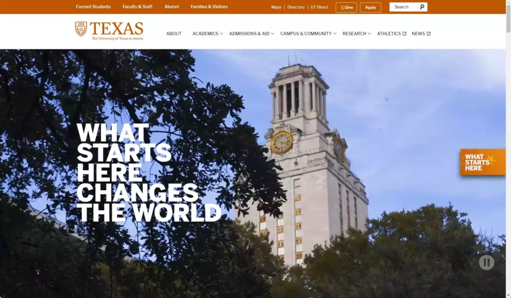
The University Of Texas At Austin (UTexas.edu), one of the country’s largest public research universities, is located in the heart of the Texas capital. With over 51,000 actively enrolled students, this university marketing team knows a thing or two about attracting potential students. And, with over 3,000 faculty members in 2024, it’s one of the most well-staffed universities in the United States.
What we like about this website:
- Homepage hero is bold and presents clear messaging
- Bold visual element takes center stage on nearly every college landing page
- Creative image effects and layered design gives unique depth to overall site design
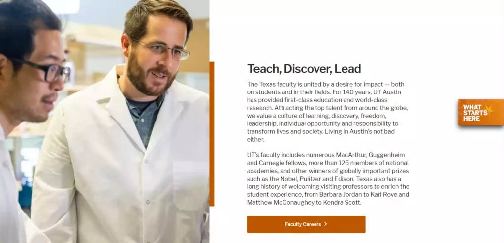
On UT-Austin’s website, users can easily navigate through each of the individual schools and university departments easily thanks to quick links located at key locations throughout.
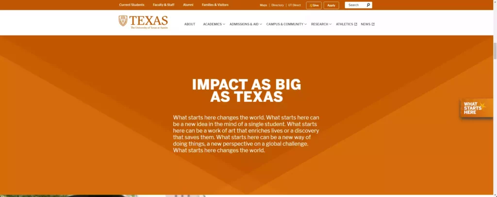
The homepage features clickable tiles for prospective/returning students or parents while also emphasizing university news & upcoming events. The Admissions and Aid tab provides easy access for users interested in applying to UT-Austin.
Stanford University
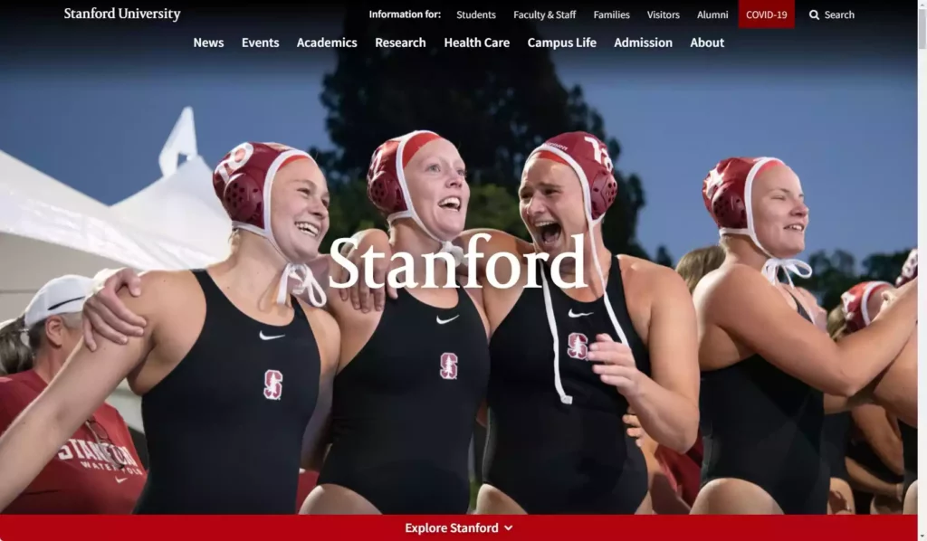
Stanford University (stanford.edu) is a private research university located in Stanford, California.
One notable feature found throughout Stanford’s web design is its consistent emphasis on responsiveness. Their homepage has consistently been ranked amongst top modern designs due to progressive thinking around digital content and usability. Of all the University website designs we’ve worked on, our engineers often regard this University’s website as a true model and something they look to often for understanding best practices with any higher education UI or UX design.
The design team responsible leads design thinking globally.
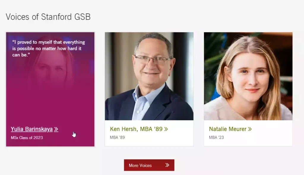
Here are some things we appreciate about this website:
- Strategic use of white space, really allows content to be well organized and easily digestible.
- Easy-to-use menu options along with dropdowns make navigating simple
- They really get the UI right, on every device, every time
- Inspiring visuals & impactful messaging help convey Stanford’s prestige
- Prominently displayed social media presence encourages engagement with visitors
- Simplicity and getting the basics right for usability
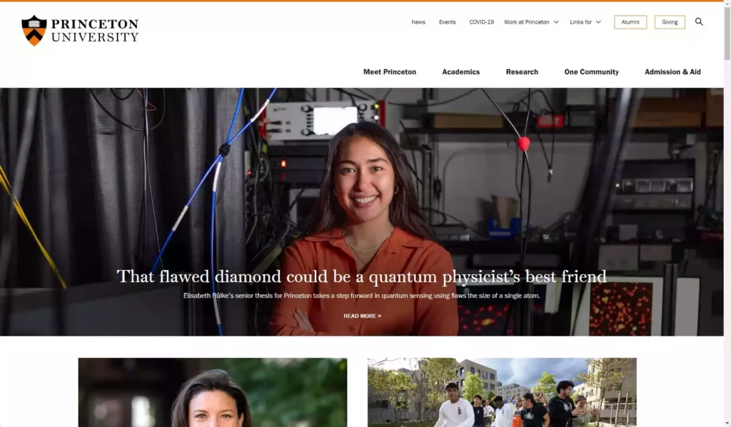
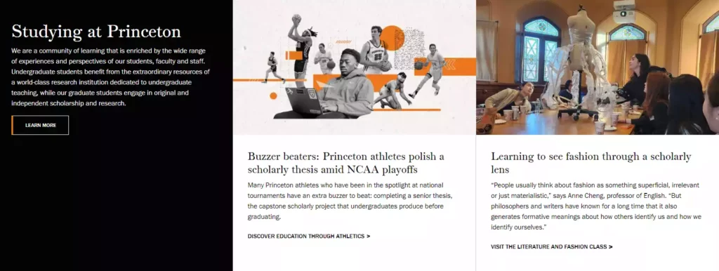
Princeton University
Princeton University (princeton.edu) is another prestigious Ivy League institution located in Princeton, New Jersey. Their website design conveys sophistication through a minimalist style while using color as an accent feature when highlighting important information.
Things we liked about this university’s online presence:
- The use of stunning photography provides context and gives visitors an immersive feel for what Princeton has to offer.
- Well-structured site architecture ensures quick access to key information such as undergraduate majors/programs available or graduate program opportunities.
In 2023, University web design is mature, and users expect it. Solid usability, clean design, these are the basic markers of a reputable university.
UCSF – University of California San Francisco
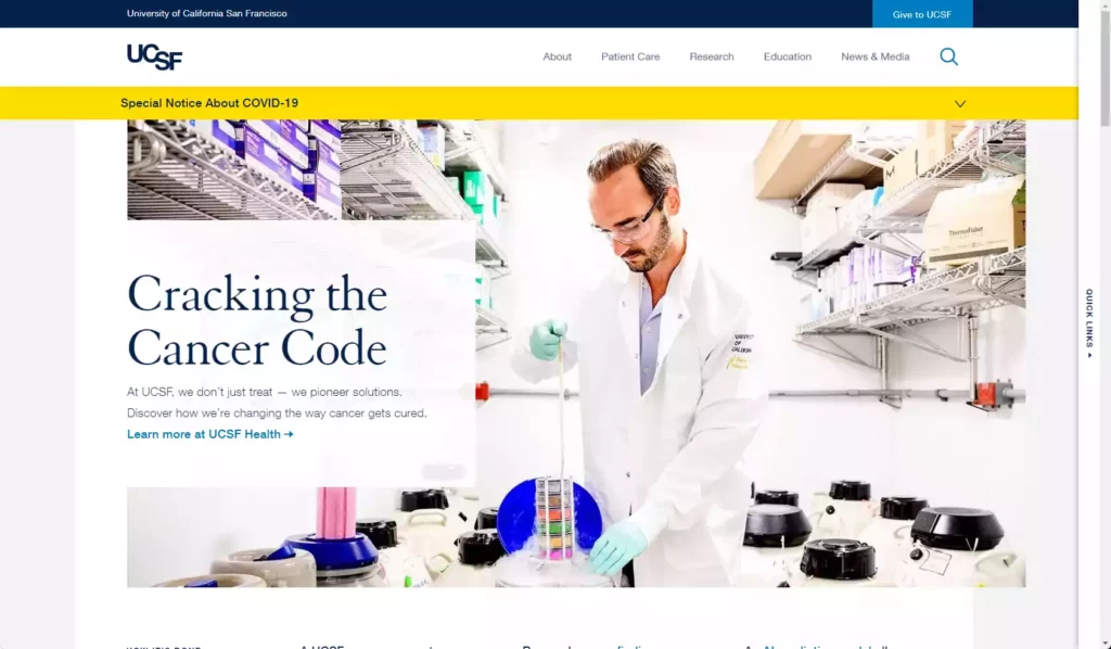
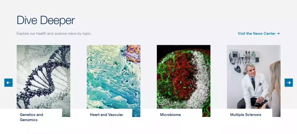
The University of California, San Francisco (ucsf.edu) is a leading medical research institution in the United States. The UCSF website features a clean design, with easy-to-find resources and information for visitors.
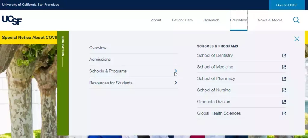
UCSF does a great job of communicating their brand identity and mission through their website, with a strong emphasis on innovation and the latest advancements in medical research.
What we like about the UCSF website:
- Simplistic, minimalist design for a university, and as one UI designer commented: “stunning visuals.”
- User-friendly interface with intuitive menu, overall easy navigation throughout site.
- Streamlined search functionality makes it easy to find specific content.
Overall, UCSF’s website effectively captures the institution’s commitment to excellence in health sciences education and research while providing a user-friendly experience for visitors.
As an organization, they’ve incorporated medical and health content as part of their main site structure.
The simplicity of their Education and Admissions landing pages is inspiring. They’ve carefully considered their user journey and are proffering resources as per each individual path’s needs.
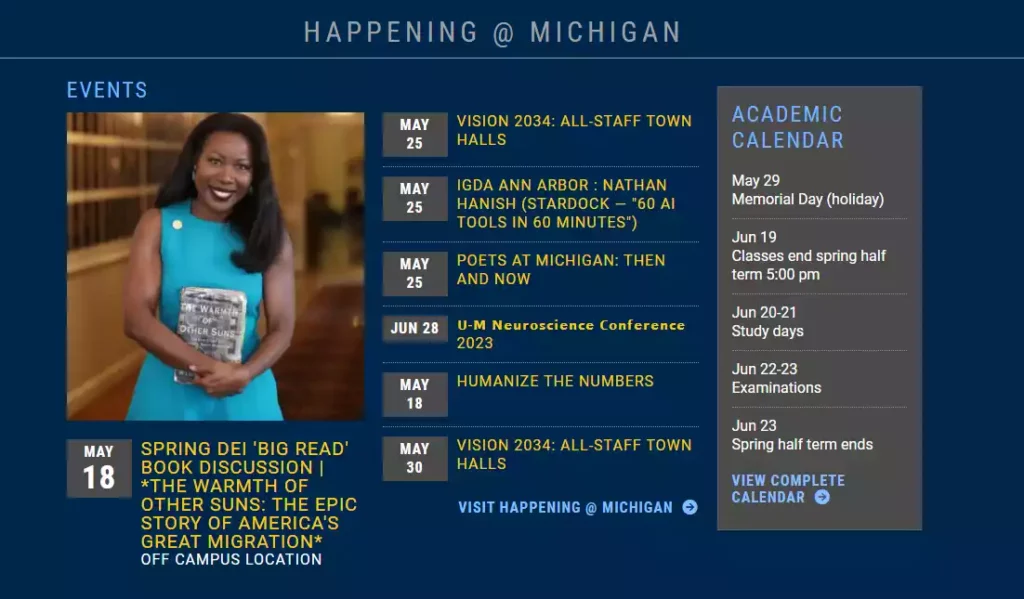
University of Michigan
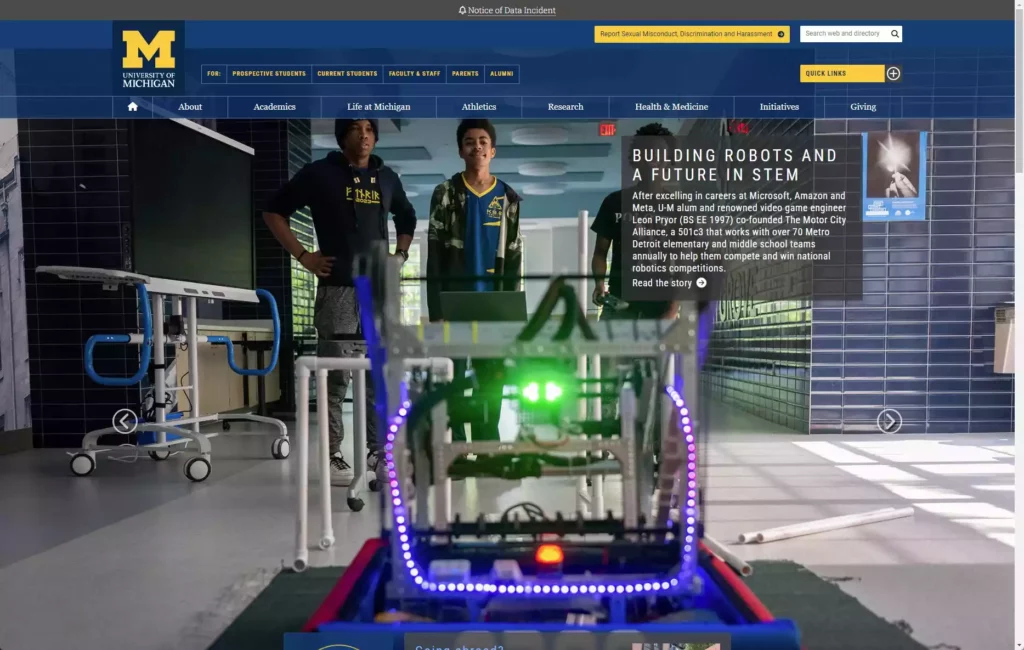
The University of Michigan (umich.edu) is a highly respected public research university in Ann Arbor, Michigan.
The university’s website uses the school colors along with a striking font that compells potential students and communicates the University’s brand values. The main navigation is also organized in tabbed sections, making it easy to find resources and information about the vast array of courses & programs available.
Overall, the Michigan’s website is easy to engage with and presents the school as being “Online” and “Available”, as some would say. It clearly emphasizes not just academics, but also extracurricular offerings and opportunities. Generally, we feel the website gives prospective students a real feel for campus life.
Things we like about Michigan’s website:
- Strong emphasis on animations, visuals, and unique design elements that create an engaging experience for users.
- Quick access to important information through five main navigation tabs (Academics, Admissions/Aid, Life at Michigan etc.).
- Well-defined hierarchy & clear visual indicators guiding visitors to key information
- In-depth resources for prospective students.
- MyUofM section helps users quickly find learning resources.
- It’s incredibly fast! The fastest University website we’ve tested, by a long way.
This university website is a great example of how a navigation-based approach can be used to present information in an organized and easy-to-use manner.
University web design isn’t easy, but Michigan really connected with this redesign. At first glance, its exactly what you expect from a large university like this, but then as you dig, every detail seems to have been considered.
New York University
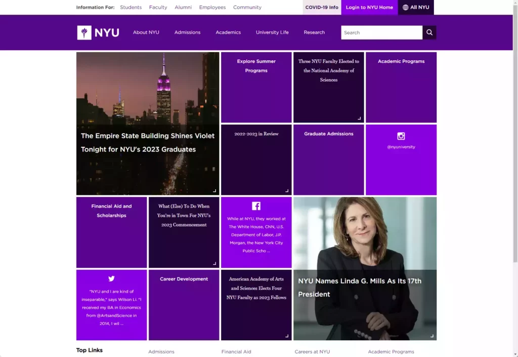
New York University (NYU.edu) is another private research university, most operantly located in New York City. NYU serves over 45,000 students in its six colleges and schools offering undergraduate, graduate, and professional degree programs.
What we like about this University’s website design:
- Layered content blocks create visual interest on the homepage
- Eye-catching videos showcase campus life from various perspectives
- Unique interactive map highlights community events & points of interest
- Really unique grid block layout is unlike any other university website design we’ve seen
- Modern and sleek design interface that reflects the university’s commitment to innovation
A deep dive into the admissions page reveals a detailed overview about the applications process as well as an open house calendar that allows prospective students to make decisions more quickly and easily. We also appreciate how this page provides information about financial aid options for students—a critical factor when making college decisions!
NYU also uses several interactive elements on their website to engage users such as an interactive map showcasing campus locations & points of interests in the area, student testimonials & video tours of student life by current NYU students. These elements help visitors get a feel of what it’s like to be part of NYU without visiting in person.
Wake Forest University
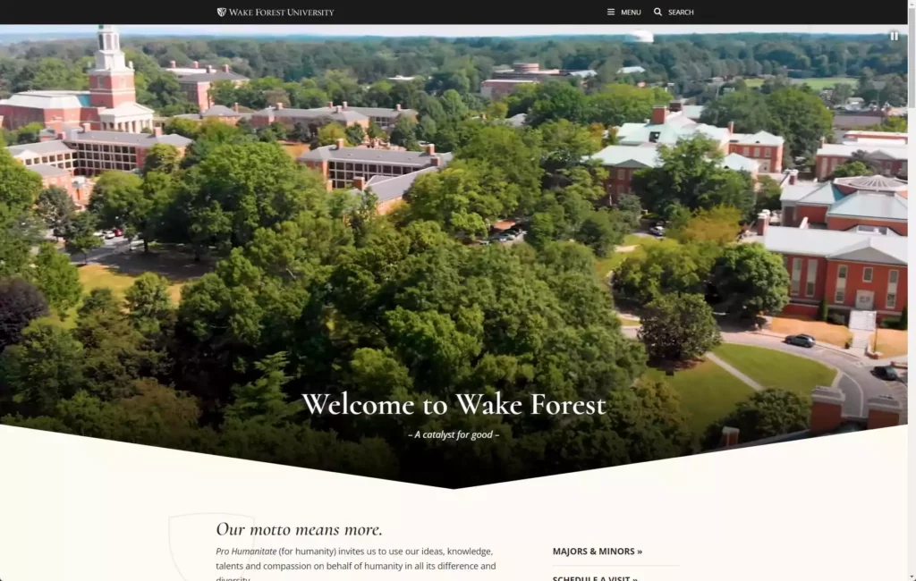
Wake Forest University (wfu.edu) is a private, four-year liberal arts college in Winston-Salem, North Carolina. They feature a visually pleasing design with bold colors and photography to emphasize their campus and student life.
Things that stand out to us on this website:
- Clean & intuitive navigation system which provides visitors quick access to key information such as admission process or course offerings.
- Consistent color scheme and typography throughout the site creates a cohesive user experience.
- Concise but informative webpages that provide prospective students with all the necessary information they need to decide whether Wake Forest might be the right fit for them.
- Dynamic content & prominent call-to-actions help keep visitors engaged.
- Comprehensive search functionality enables quick access to specific information.
- Notable attention to accessibility, ensuring the website is inclusive and user-friendly for all visitors.
We love that they are drawing from historical branding and really accepting their identity. Their current graphics and style are “very Wake Forest”, in one of our designer’s words.

Berklee College of Music
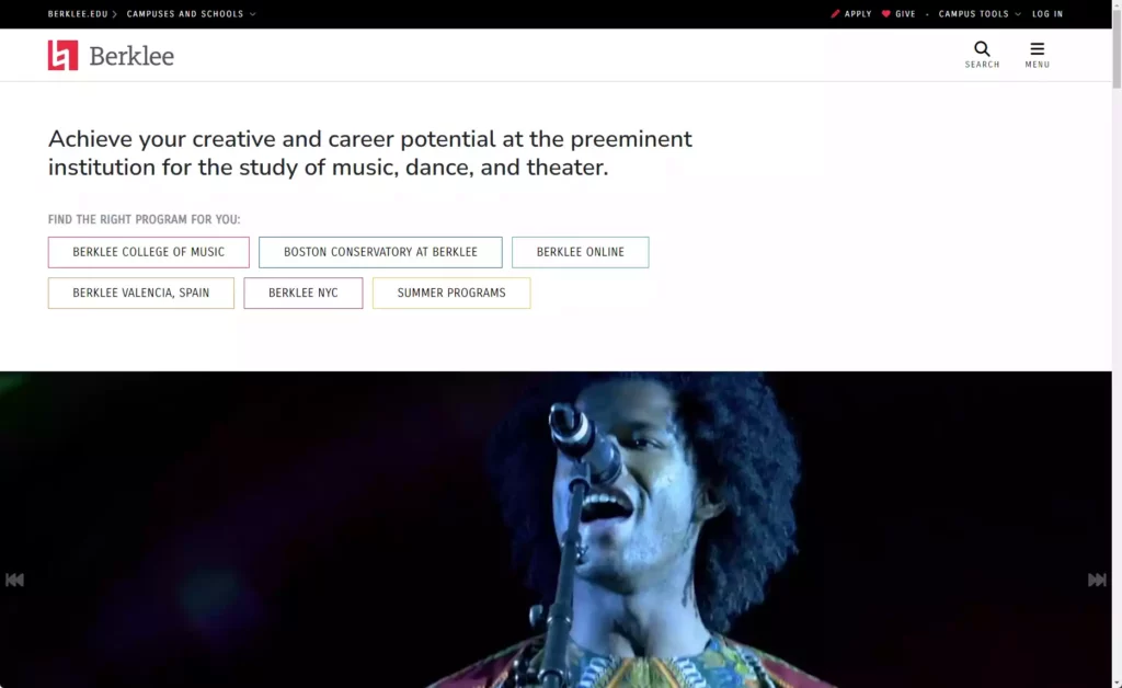
Burklee College of Music (burklee.edu) is a renowned institution located in Boston, Massachusetts, specializing in contemporary music education. As one of the leading schools in the field, Berklee’s website reflects its dedication to artistic expression and passion for music.
Berklee College effectively highlights its impressive roster of successful alumni throughout its website. Real-life examples of accomplished musicians who have graduated from Berklee create a sense of inspiration for aspiring students. The use of videos, biographies, and testimonials amplifies the college’s reputation as a launchpad for emerging talent.
Recognizing the importance of mobile accessibility, Berklee’s website is fully optimized for a seamless browsing experience across different devices. The responsive design ensures that visitors can access the information they need, no matter where they are.
What we love about Burklee’s UX:
- “It’s such a pleasant experience to use this website!” It feels like every aspect of the UI was considered deeply.
- Engaging multimedia elements that showcase the college’s musical talent and vibrant community
- Seamless integration of music samples and videos throughout the site, providing visitors an immersive experience
- Strategically placed calls-to-action drive interest and encourage prospective students to explore various programs and degrees
- The Burklee College design team is clearly having fun and enjoying the challenge with respect to the school’s history and openness; overall it feels incredibly progressive and modern
Berklee College of Music’s website impresses with its immersive multimedia experience, intuitive navigation, and strong focus on showcasing student success stories.
Overall, Berklee College of Music’s website, we feel, successfully captures the essence of its vibrant and dynamic community while providing seamless navigation and engaging content for visitors.
Santa Clara University
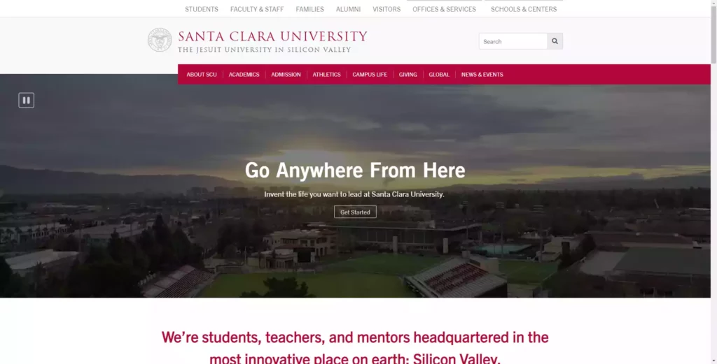
Santa Clara University (scu.edu) is a private Jesuit university with a thriving student population of over 8,000. Their web design stands out as one of the most modern and contemporary redesigns of any higher education website this year.
Features that make this university’s website stand out:
- Right-anchored top menu is unique
- Large visuals keep visitors engaged & gives a look at life on campus
- Simple & clean navigation that matches the homepage’s design aesthetic
- Website offers plenty of resources for admitted students

The way Santa Clara University’s website is designed allows visitors to easily get a glimpse of the school’s central values: its commitment to ethics, technological advancement, and experiential learning. Prospective students can easily access all the information they need to make an informed decision about their future education.
Ohio State University
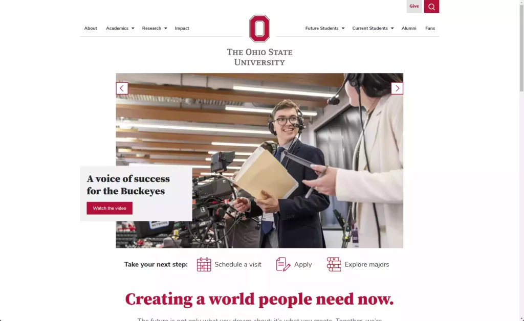
Ohio State University (OSU.edu) is the flagship school of Ohio’s higher education system. With over 42,000 students and more than 2,500 faculty members, it’s one of the largest universities in the country.
What we like about OSU’s website:
- Clean and simple homepage layout with top navigation for quick access to key information
- Tabs highlight top admissions news stories clearly
- Unique visual elements break up content into easily digestible chunks
- Responsive UI/UX is well-considered and very effective, one of the most consistent UI designs our UI/UX design team has seen this year
The homepage features clean design & clearly labeled categories for different admissions programs & degrees available at OSU. The site also includes an interactive map featuring centers & programs all over Ohio state with a quick link to each one.
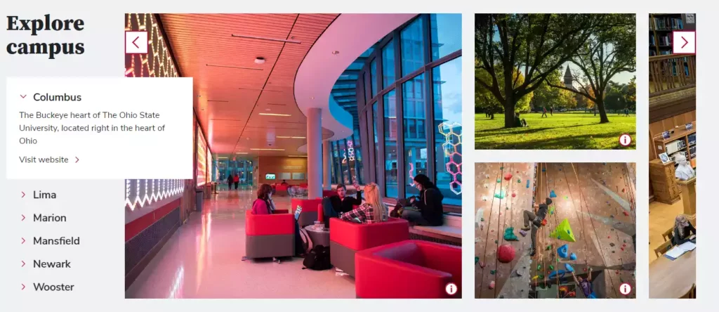
OSU also allows prospective students to explore their path and understand their program in-depth, something unique, not seen on many higher education websites.
The footer makes it easy for users to find more information quickly and effectively without having to scroll through pages of content. Overall, Ohio State University’s website encourages visitors to explore the university without feeling overwhelmed by its size or complexity.
University of Pennsylvania
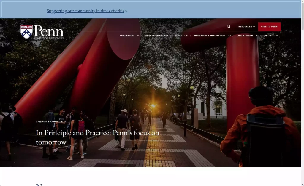
The University of Pennsylvania (UPenn.edu) is a private Ivy League university located in Philadelphia, PA. Its website features a beautiful homepage banner with engaging photos and videos of students, academics, and campus life.
What we like about this higher-Ed website:
- Tiles break up content in an interesting way while still providing key information
- Bold colors & visuals make features stand out without cluttering the page
- Videos on homepage introduce campus life & academic offerings
- After their minor redesign in 2023, new bolder fonts and brighter vision is presented; a significant improvement over last year’s homepage design
- Overall, a tight brand and UI design is carried successfully through the site
The UPenn website clearly emphasizes its community with dynamic images. The video homepage hero, and the emphasized news content with strong editorial headlines and editorial photography make this University website stand out.
SCAD: Savannah College of Art and Design
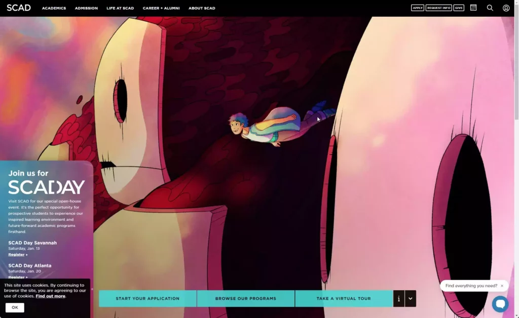
Savannah College of Art and Design (SCAD.edu) is a smaller private, non-profit university located in picturesque Savannah, Georgia. It has been consistently ranked as one of the top schools for art and design in the US.
They certainly know about web design and creativity.
Overall, SCAD’s website perfectly reflects the school’s creative and forward-thinking approach to art and design education. From the typography to the color palettes, everything has been well thought out to attract prospective students who are looking for an unconventional learning experience.
SCAD’s website showcases the university’s commitment to a unique and innovative approach to creative education. The homepage presents visitors with the striking visual impact of full-width imagery coupled with white space.
What sets SCAD’s website apart is its stunningly elegant and modern design, featuring a black-and-white color scheme and stunning use of typography. The design elements allow visitors to focus on the university’s core message and values.
Here are some things we appreciate about SCAD’s website:
- High-quality visuals that showcase student work, campus life, and design projects
- Clean and intuitive navigation system that provides quick access to key information
- Overall, very modern ux, taking into account the edgy and young audience the school is aiming to attract
- Unique collage design elements that create an engaging experience for users
- Subtle animations that add a touch of sophistication to the overall website design
The Savannah College of Art and Design’s website serves as a testament to its commitment to creating holistic experiences for their students. The use of stunning full-screen photography immerses visitors in campus life, while clear calls-to-action guide them through the admissions process.
Regent College
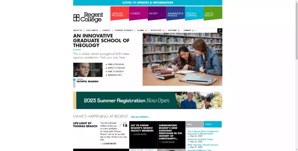
Regent College (regent-college.edu) is an evangelical Christian graduate school located in Vancouver, British Columbia. Established in 1968, its mission is to form disciples rooted in the biblical narrative and equipped for service in the world.
The Regent College website stands out from other higher education websites because it so well manages the balance between progressive design and conservativism of the school’s history. The site’s design aesthetic is clean, with a focus on white space that effectively emphasizes their mission statement:
“To cultivate intelligent, vigorous, and joyful commitment to Jesus Christ, His church, and His world.”
Here are some other noteworthy elements of the Regent College website:
Navigation: at the top of the homepage, there is a horizontal navigational bar with options including Graduate Programs, Courses, Faculty, Admissions and Finance, Lifelong Learning, and Give to Regent. The site has a search bar that promotes easy navigation and finds what you are after quickly.
Appealing visuals: Regent College’s website is characterized by large, high-definition visuals that showcase the beautiful campus and attractive student life. The team has used videos and unique imagery to serve in providing an overview of degree programs and campus life options.
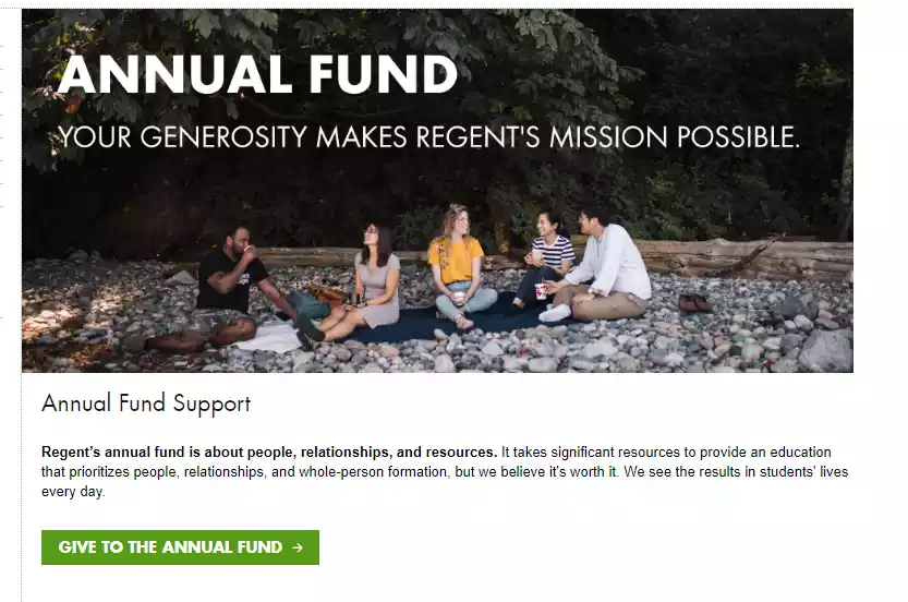
Clear calls-to-action: One of the first things visitors will notice is that Regent College has very clearly marked CTAs throughout its website. The highlighted CTAs drive visitors to admissions pages; financial aid, donor support options, or to course listings.
Responsive design: Regent College’s website looks great on any device from which it is viewed, displaying clean code and well-formatted content throughout.
Accessibility focus: as a faith-based institution with a mission to serve all people, Regent College is an accessible online environment suitable for people with various disabilities or different assistive technology needs.
Regent College’s library resources are also integrated into the website experience so that prospective students can access all the resources they need at their fingertips. With quick access to resources, bibliographies, and search tools, full- and part-time students can easily find the research materials they need to excel.
Overall, Regent College’s website stands out due to its clean, user-friendly design, rich content and functionality, and distinct emphasis on their mission statement. It is a visually stunning example of a higher education institution website done right.
The University of Oxford
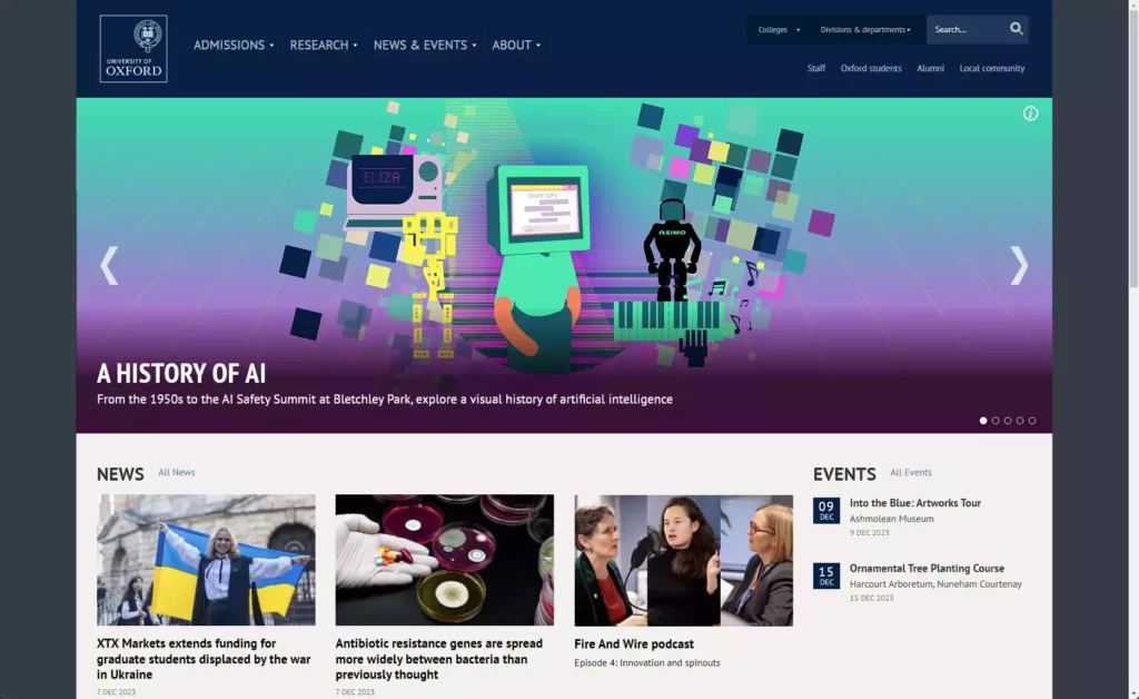
The University of Oxford (ox.ac.uk) is probably one of the world’s most prestigious universities. Not in the United States (yes, we know!), this well-known university is located in Oxford, England, it is definitively one of the oldest English-speaking universities in the entire world. The university has a rich history that dates back to the 12th century.

The university website reflects this rich heritage and academic excellence with its clean design, elegant typography, and striking imagery. The homepage features an eye-catching photo of Oxford’s historic architecture, which immediately transports visitors to the heart of the university.
One notable aspect of Oxford’s website is its strong focus on showcasing the university’s academic achievement and research prowess. The homepage features prominent links to news articles about the school’s latest research discoveries, which demonstrate Oxford’s status as a leading institution for cutting-edge study and innovation.
Moreover, it doesn’t shy away from creating accessible content. The University offers their podcasts for audio learners and their online journal is built with accessibility considerations in mind.
However, what stands out most about Oxford’s website is its extensive resources section for current students. This section features everything from course catalogs to exam schedules and provides easy access to important academic information.
Some things we really appreciated about this university website:
- Engaging Photography: As a historic university, Oxford has an abundance of captivating imagery that reflects its rich heritage. The website features stunning photography of the city’s architecture, scenic landscapes, and academic facilities, which immediately immerses visitors in the university’s unique atmosphere.
- A Strong Focus on Research: Oxford is a world leader in academic research, and the university’s website reinforces this by highlighting its latest research breakthroughs and publications through prominent blocks on the homepage.
- Subtle Animations: Across this university’s website, we continue to see subtle (but effective) use of animations and movement that help guide users and ease their experience.
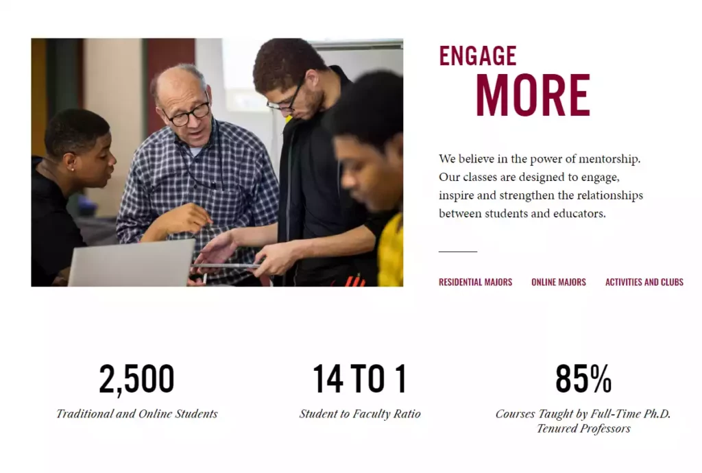
Morehouse College
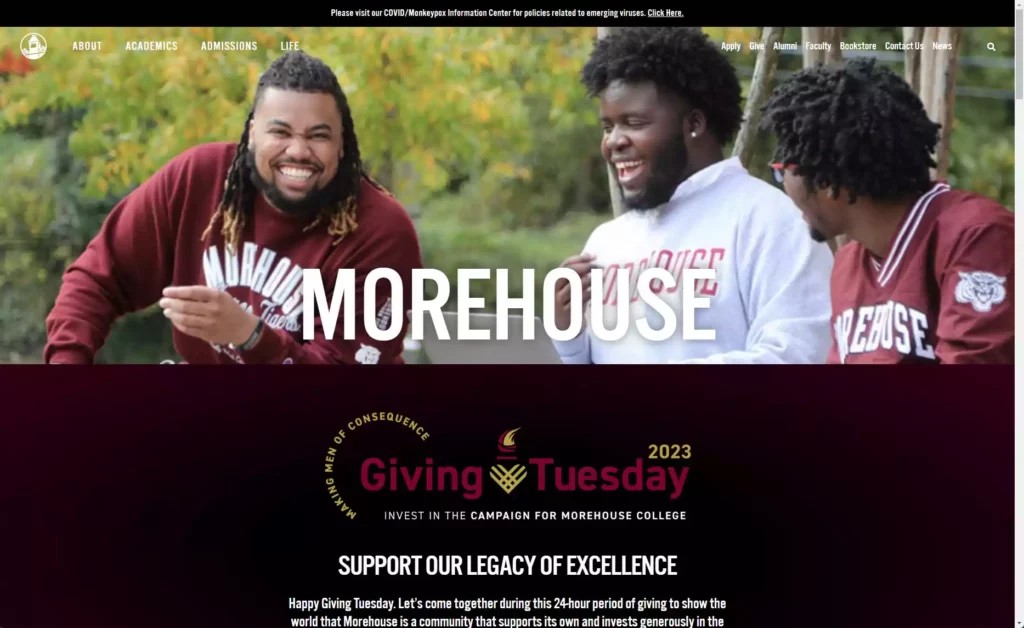
Morehouse College (morehouse.edu), is a private historically black men’s liberal arts college located in the heart of the American south: Atlanta, Georgia. With a mission to “lead lives of consequence”, the college aims to develop men with disciplined minds who will lead lives of leadership and service. Morehouse has been recognized as the alma mater of pioneers such as Dr. Martin Luther King, Jr. and Spike Lee.
What makes Morehouse College’s website stand out:
From the moment you visit the homepage, it is clear that Morehouse takes its mission seriously. The homepage includes an inspiring video banner showcasing their strong commitment to cultivating young men who will make an impact in society.
The website navigation is simple and intuitive for visitors. With easy-to-click buttons on the homepage, visitors can easily access important information such as admissions requirements, academic programs, and campus life.
Morehouse’s “Impact” section highlights the achievements of current students and alumni. This showcases their efforts to create real-life change and impact as part of their education at the institution.
What helps Morehouse make the list:
- The use of strong contrast black-and-white photography provides contextual depth to the entire site
- Well-structured homepage leads visitors through a clear call-to-action around all vital information they need
- The typography throughout the site is bold & readable
- Highly responsive design that looks great on all devices
Morehouse College current website design portrays excellence in simplicity coupled with strong design fundamentals. Every aspect of the website conveys a sense of purpose, and it aligns seamlessly with Morehouse’s core values and mission.
Massachusetts Institute of Technology
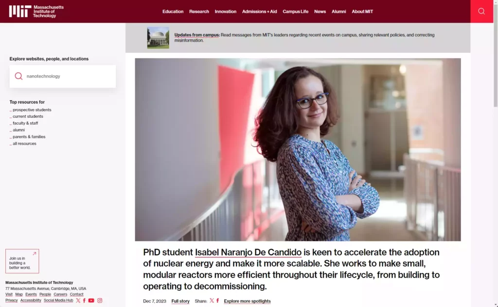
Massachusetts Institute of Technology (mit.edu) is a renowned private research university located in Cambridge, Massachusetts. Known for its cutting-edge technology and innovative education, MIT stands as one of the world’s most prestigious institutions.
What sets MIT’s website apart:
- Clean and modern design: The website features a sleek and minimalist design that reflects the institute’s forward-thinking approach to education and research.
- Easy navigation: MIT’s website prioritizes intuitive navigation by offering clearly defined menus and a search function, ensuring that users can quickly find the information they need.
- Interactive elements: The website incorporates interactive elements (like this 360-degree virtual tour), allowing prospective students to explore the beautiful campus virtually and get a sense of MIT’s unique environment.
- Emphasis on student opportunities: MIT highlights various opportunities available to students through internships, research programs, entrepreneurship initiatives, and global experiences. This showcases their commitment to empowering students beyond the traditional classroom setting.
- Inclusion efforts: MIT demonstrates their commitment to diversity and inclusion through dedicated sections highlighting initiatives promoting equality within their community. This showcases their emphasis on creating an inclusive environment for all students.
MIT’s commitment to embracing cutting-edge design principles sets a benchmark in higher education UI/UX design. The website achieves an impressive balance between user-friendliness and visually pleasing aesthetics.
Our Considerations for Awarding These Designs
When evaluating hundreds of university website design along the way, we considered several key factors, which we used to determine which was the most noteworthy amongst so many institutions.
The following criteria guided our selection process:
- User Experience: We focused on websites that provided a seamless user experience. Easy navigation and accessibility to information is most important.
- Visual Appeal and Aesthetics: We looked for university website design that had visually appealing presentation, utilizing creative and intuitive layouts with modern aesthetics that align with their brand. Consistent design patterns continued to play a significant factor in our evaluation.
- Brand Representation: A compelling university website should embody the institution’s values, missions, and strengths authentically. We assessed how effectively each design conveyed the personality and prestige of the respective university or college.
- Modern Design Trends: Our selection focused on higher educations websites that incorporated modern design trends without compromising usability—designs that strike a balance between visually appealing aesthetics and efficient functionality.
- Content Strategy: We analyzed how universities effectively communicated their unique selling points, academic offerings, and campus culture through their website content. Engaging copywriting, multimedia integration, and thoughtful presentation of information contributed to the overall strength of the websites.
- Innovation and Best Practices: We recognized institutions that showcased innovative design thinking by incorporating industry best practices. This included strategic use of white space, clear typography, intuitive navigation, integration of social media platforms, and other cutting-edge features that contribute to an exceptional user interface.
By carefully evaluating these aspects across various university websites, we identified those that excelled in providing informative content, engaging experiences, and efficient navigation to prospective students, current students, alumni, faculty members alike.
It is important to note that this is not an exhaustive list of criteria, but rather representative of the key considerations we evaluated in recognizing the outstanding design work showcased by these universities.